
Part A: Introducing stats and numbers
[With thanks to The Benchpress Project]
Numbers and statistics are in almost every news story. Whether you are a specialist health reporter, or writing a story on the latest crime rates, it is important to be savvy about numbers and defend yourself against misleading figures.
Watch this online briefing (25 minutes) produced by the Australian Science Media Centre.
EVENT FOR JOURNALISTS: Getting your head around numbers and stats from AusSMC on Vimeo.
This module covers some of the basics that journalists need to know to help make sense out of statistics and data, and will look at some common pitfalls and red flags you should watch for. We also recommend that you look at this list of 100 savvy sites on statistics and quantitative analysis.
Questioning numbers
When you come across a number in a story or press release, beware. Before making it your own, ask:
- Who generated the number?
- What are their credentials? Are they selling something?
If the number comes from a study or research—is it peer reviewed? Has anyone independent said it is any good? What is the publishing journal’s ranking?
Good reporting gives a balanced view of the numbers being reported. The most likely outcome is more useful for your audience to know than the most extreme.
Beware of cherry picking. Blips, abnormal highs and lows happen all the time. Single events carry little information. When talking about trends it’s important to question why a particular time period has been chosen. Is the starting or finishing point unusually high or unusually low? Can you get hold of the full data set?
Exercise
Find a media release or a story that includes statistics about research. How are statistics used? Do you think this is a credible use of those statistics? Why or why not? Would you have written or used the statistics differently? Explain.
Making sense of surveys and polls
Were those questioned a fair representation of the population at large? How were they selected for the survey? Generally the more people you ask, the more accurate the result is likely to be, provided that those people are drawn randomly from the population.
Was it sponsored by anyone? Is it self-selecting, or is there some other selection bias? Was it run by an organisation or through a website that could affect who responded? For example Bride to Be magazine regularly releases a poll on the average cost of a wedding in Australia suggesting it is now over $48,000—but is this survey likely to be biased towards higher spending weddings? Are people who have budget weddings likely to be an audience of this magazine?
Be wary of small shifts in polls. Reputable polling companies will note their margin of error or ‘confidence interval’—usually plus or minus three per cent. For example, if the poll says 50% of people will vote Labor, the real value lies somewhere between 47% and 53%. So if the next poll reports that 53% of people will now vote Labor—this is within the margin of error and may not be a shift in opinion at all.
Do you know exactly what the group was asked? The wording of a question and the order of questions can hugely influence the answer you get.
A poll may be reported as showing that 99% of the public support increased spending on foreign aid but the question they were actually asked might have been: “Would you support increased spending on foreign aid or should the money go to higher salaries for MPs?”
Exercise
Find a story that reports the results of survey of people’s attitudes (e.g. to climate change). Describe what the story was about and how the results of the survey were used in the story. Did you get a clear idea of what the questions were about? Did they make it clear what the confidence interval was? Do you think their sample was representative or not? Explain your answers.
For further reading/investigation
Sense About Science guides, in particular: www.senseaboutscience.org/resources.php/1/making-sense-of-statistics
Statistical Assessment Service—STATS stats.org/
Health news review—Tips for Understanding Studies www.healthnewsreview.org/toolkit/tips-for-understanding-studies/
Journalist’s resource: journalistsresource.org/reference/foundations/math-for-journalists/
World Federation of Science Journalists www.wfsj.org/course/lesson.htm?e=e09#L09P00
Part B: How to translate the stats so they mean something
Big numbers can be misleading
Numbers are easier to swallow when broken down eg dividing the cost of a government scheme by the number of Australian households (7.6 million) gives the cost to each Australian household.
Beware of averages
Different averages measure different things—for most people the average is the mean—but sometimes this can be misleading. For example, on average, everyone in the world has one ovary. It’s technically true, but not a very accurate summary of men or women!
The mean—the sum of the listed values divided by the number of values in the list. It is extremely sensitive to highs and lows: if Bill Gates came to live in Australia, mean wealth would increase. But are you any richer?
The median—the middle point. Tells us the income of the person in the middle. Half the population get less than this, half more.
The mode—the most common value. Tells us the salary band with the most people compared to other bands.
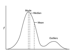
In this graph, the mean is higher than the median or mode because it is sensitive to a group of people who lie outside the main curve or ‘outliers’. The most useful statistic often depends on the shape of the curve.
Absolute versus relative risk
Absolute risk is the likelihood something will happen. Relative risk is the difference in the likelihood that something will happen. It’s always best to talk in terms of absolute risk if possible.
Relative risk allows you to compare between different risk levels. For example: “A smoker’s risk of developing coronary heart disease is two to four times that of a nonsmoker’s.” But relative risk tells you nothing about the actual risk.
For example, buying a second lottery ticket doubles your chance of winning, but the chance was so small to start with, it’s hardly a meaningful increase. If a substance increases the risk of cancer, describe how many extra cases it would produce in 100 people, or 1000 people, rather than the percentage risk increase.
Odds ratios—beware
Watch this short video (2:10) by statistics researcher Susannah Cramb.
Odds ratios are often reported in scientific studies but they can be difficult to translate into everyday language and are best avoided.
When you talk about odds, you’re talking about the chance that something WILL happen divided by the chance that it will NOT happen. An odds ratio is used when you want to compare the odds of something occurring to two different groups. It is the ratio of the odds for the first group and the odds for the second group. Importantly, it’s not the same as relative risk.
For example—A study examined the link between acupuncture and successful IVF . In this study the odds ratio—that is the odds of pregnancy through IVF and acupuncture divided by the odds of pregnancy through IVF without acupuncture—was 1.65.
You might think this means that acupuncture increases the success rate of IVF by 65 percent—but in fact the improvement in this study was more like 10%, and in absolute terms 10 patients would need to be treated with acupuncture to bring about one additional pregnancy.
Beware of causation and correlation
Beware of suggesting causation when there is only a correlation.
Lots of studies talk about ‘associations’ and ‘links’ between the things being measured but there is a big difference between showing a link and actually showing that one thing causes another—for example, obese people may spend more time using Facebook (correlation) but that doesn’t mean that using Facebook makes you overweight (causation).
Generally, a correlation must meet the Bradford Hill Criteria before being considered as possible causation.
Exercise
- Find stories that report absolute and relative risk. Describe how the stories reported risk. How well did the stories report the level of risk? Do you think they may have confused their readers? Explain your answers.
- Breast cancer screening by mammography lowers risk of dying for women around sixty by 25 percent. About 4 in 1000 women in this age group die of breast cancer. Rewrite these two sentences to make the level of risk clearer.
- Correlation does not equal causation — the fact that two phenomena are related, does not mean that one is the cause of the other. Rewrite the following sentence so that it makes more scientific sense. `Taller people earn more than shorter people.
Check out all the exercises for this module.
For further reading/investigation
Polls and surveys
20 Questions A Journalist Should Ask About Poll Results
Correlation versus causation
www.businessweek.com/magazine/correlation-or-causation-12012011-gfx.html
www.gapminder.org/videos/the-joy-of-stats/
en.wikipedia.org/wiki/Bradford Hill_criteria
Odds ratios
www.stats.org/faq_odds_ratios.htm
www.stats.org/stories/2008/acupuncture_fertility_march_3_08.html
Scijourno is a collaborative project
 |
The University of Western Australia also contributed to the academic advisory group.